IAC logo

The world of non-commercial film and A-V

Events Diary Search
The Film and Video Institute find us on facebook Join us on Facebook


SMPTE HD colour bars - approximated.Colours - part 1

I do not have to tell all you film makers of the importance of the right use of colour to communicate and of course the same applies to a website. However we got the impression from many club websites that the opportunity to use all the 16 million colours available to the webmaster had gone a bit to people's heads - some did end up looking rather garish. And this communicates amateurish and crude.

So what can colour do for your website?
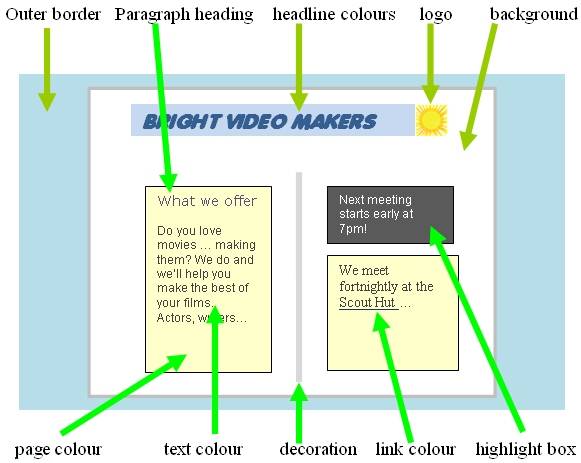
  1. Usability -making the text easy to read.
  2. Harmony - we are representing an art form so the colours have to work together and not clash

  3. Emphasis and navigation - our use of colour will help pull the reader to the most important bits so LATEST is in red and would normally contrast with the other colours used.

  4. Suitability - the colours you use depend on the readers you are aiming for and the subject - so, for example, as a club for grown-ups, you would not use loads of bright primary colours. Another example is that your site won't have much in common (colourwise) with a site selling organic food which typically might use shades of browns and greens.

Text

Text must be legible. Through years of books and magazines we have become used to black text on white ... but the active white of a screen is not the same as the duller white of paper. So whilst you need a good contrast between the page and the words extremes can be difficult. For the major areas of text it is usually worth reducing the starkest contrast levels and using a dark text colour on a light page colour.

For example Text box with blue writing on white background.
or Text box with fark grey writing on pale yellow background.
Text box with white writing on black background.You might be tempted reverse your text colour scheme to get impact:

But few people like to read a lot of white text on a black background so it is probably best to use this approach sparingly: for example for a footnote or an additional information box. You will also find that white on dark grey (as in the "highlight box" below is a little easier on the eye and brain.

The canvas

You have chosen your text colours but it is surprising how many more a website might require. This is where you have to make sure that your colour choices work together to look attractive and coherent. Consider this schematic for a whole webpage.

Diagram showing a scheme of colours used for different parts of a web page.

(Decoration includes divider lines, picture borders, arrows and fancy underlines. Outer Border is what is seen on wide displays at either side of the 800 pixel wide web page we recommend you to build.)

As I mentioned earlier some club websites have become rather garish so restrain yourself! So for example, the outer border colour should be muted and 'controlled'. It is there as a supporting role to the main 'act' - the actual page.

Go to Colours part 2- Right arrow.


Website Makeover Guides - Introduction

What Should the Content Be? | Navigation | Planning Navigation | Anchors & Links | Words | Getting Pictures | Getting & Using Pictures
Processing Pictures | Video | Presentation Pictures | Colours | Layout Principles | Layout Schemes | Fonts | What is SEO?
Search Engine Factors | Check Your Search Ranking | Stay Legal | Website Health Check | Website No Goes more to come ...

A Beginner's Guide to Creating a Club Website with Weebly

Don't Panic! | Signing up to Weebly | Making your first (elegant) page | Adding more pages and navigation
Adding pictures and words | Creating a complex Coming Soon Page | Adding Forms, Emails, Maps and Videos.

IAC Competition to find the Best Club Website 2011


Share your passions.

Audience silhouette.

Share your stories.

Page updated on 19 January 2011
Contact Webmaster
Data Privacy
find us on facebook Join us on Facebook
Bookmark and Share
UNICA information UNICA member
Company Limited by Guarantee No. 00269085. Registered Charity No. 260467. Authors' views are not necessarily those of the Institute of Amateur Cinematographers. Website hosted by Merula. JavaScripts by JavaScript Source. Menu by Live Web Institute. Art work by Tony Kendle.