
|
The world of non-commercial film and A-V |
Events Diary | Search | ||
| The Film and Video Institute | | ||||
NAVIGATION |
||||||||||
- or don't get lost in cyberspaceHave you ever visited a website and spent what seemed like forever clicking on hyperlinks trying to find what you know is there - SOMEWHERE. Maybe you have seen the item before or maybe it is referred to on the front (Home) page, maybe it is a crucial piece of info like an address or a price - something that you are sure that must be there. Moreover, you can't imagine why the website designer did not make it easy to find. Remember how irritated you became as you searched and searched and what you started to feel about the organisation (and maybe the cruel webmaster who clearly designed it to drive all the site visitors crazy), OR maybe you just clicked away never to return. It is so easy to mess up website navigation. You may think if you are just starting a website with just 4/5 pages it is very straightforward, hardly worth worrying about. But your website will grow, I guarantee it, and the enemy to good navigation is to let your site grow haphazardly page by page and bit by bit, burying pages and links where even Sherlock Holmes could not find them. So your site needs planning and the question is how you do plan it and what rules should guide you? |
Follow the signs ...Most people are lazy and will not bother to search your site clicking here and there - so anything that is important should go on the Home page where most people will arrive. I listed these out in the content article. So if you think your navigation is a bit dodgy just putting all this important stuff on the front (Home) page is an easy quick way to ensure crucial info is easy to get to. But you still need to work out the overall site navigation: Ideally this should be done before you start but there is nothing to stop you going through your current site and assessing it afresh. Every website needs a main menu (a row or column of hyperlinks that lead to the main sections) which is the same on every page. Where you put this menu or what it looks like I deal with under layout, style and design but there is one golden rule - it must be on every page (the only exceptions are things like newsletter pdfs that pop up on a separate page). There will probably be extra links on some pages but the basic menu will ensure that wherever you are on the site you can get back to these main menu pages. This gives your site structure (and helps you look at it logically) and nowadays every web surfer knows this is how you get around and find the important bits. |
|||||||||
|
||||||||||
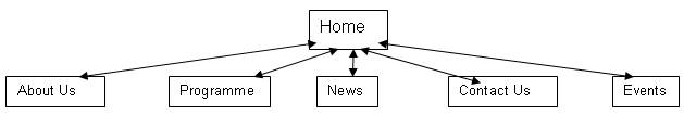
The layout
On a piece of paper, lay out the main sections which will contain the main
info* areas - like
this:
|
||||||||||
 The next rule is not to have too many of these as it will become
too much to scan -people don't read websites like a book but scan them looking
for something they want or catches their interest. Our club site has 8, the
IAC has 12 - you can usually get by with 5 or 6. The next rule is not to have too many of these as it will become
too much to scan -people don't read websites like a book but scan them looking
for something they want or catches their interest. Our club site has 8, the
IAC has 12 - you can usually get by with 5 or 6.
How many main menu headers you have also depends on the next principle. |
Nothing important should be more than one click away from the front
(Home) page - we are back to laziness again. The opposite of this is that items which are not that important must not be allowed to clog up access to the important stuff and so they can be reached by clicking though from one of the main pages not necessarily from the front page. So think of the Home page as the centre of the wheel, the main menu items as the spokes and then other stuff further out from these main spokes. |
|||||||||
|
||||||||||
|
Website Makeover Guides - Introduction
What Should the Content Be? |
Navigation |
Planning Navigation
| Anchors & Links |
Words |
Getting Pictures |
Getting & Using
Pictures A Beginner's Guide to Creating a Club Website with Weebly
Don't Panic! |
Signing up to Weebly |
Making your first (elegant) page
| Adding more pages and
navigation |
||||||||||
Share your passions.
Share your stories.